An older image, but relevant today as the System Scribing Lab gets underway. This is information submitted for the publication in the book: Graphic Recording; Live Illustrations for Meetings, Conferences and Workshops. It helps describe the process better than i could now recall>
How would you complete the sentence “What’s really interesting about this graphic recording is…”?
… that the final picture reflects a highly integrated synthesis of four days’ worth of live content.
Is there a story about how you arrived at the visuals, style, or technique used in this graphic recording?
There is a certain freedom of expression that comes with the experience of working with familiar materials over time, in this case dry erase marker on a large, flat surface. Approaching this wall as an experiment with layered iteration, I gave myself full permission to add, subtract, expand, and relocate content as it made sense to the overall picture, even at the expense of completely eliminating information.
What’s the most interesting or effective or powerful technique that you used in this graphic recording (maybe it’s the one that you used the most, but maybe it’s one that you only used for a few details, but it really makes the connections come alive)—and why did you choose it?
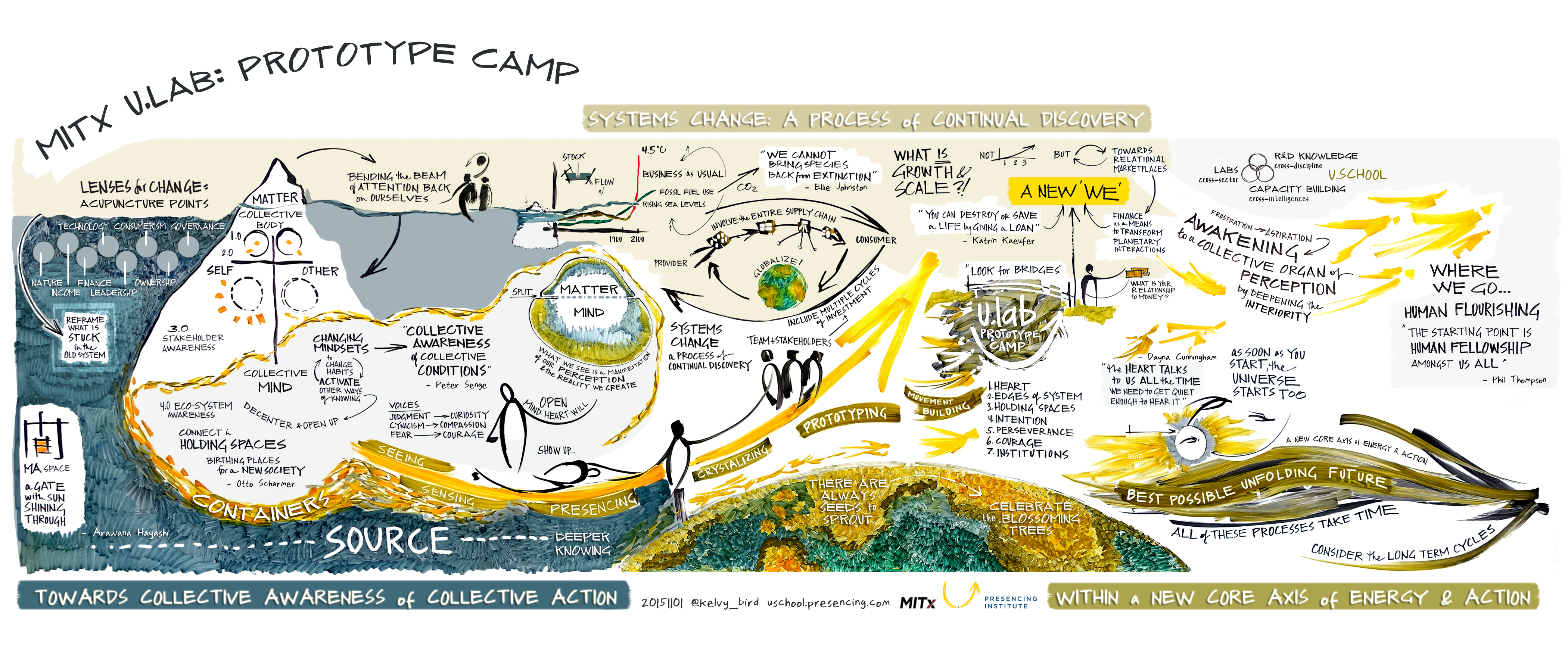
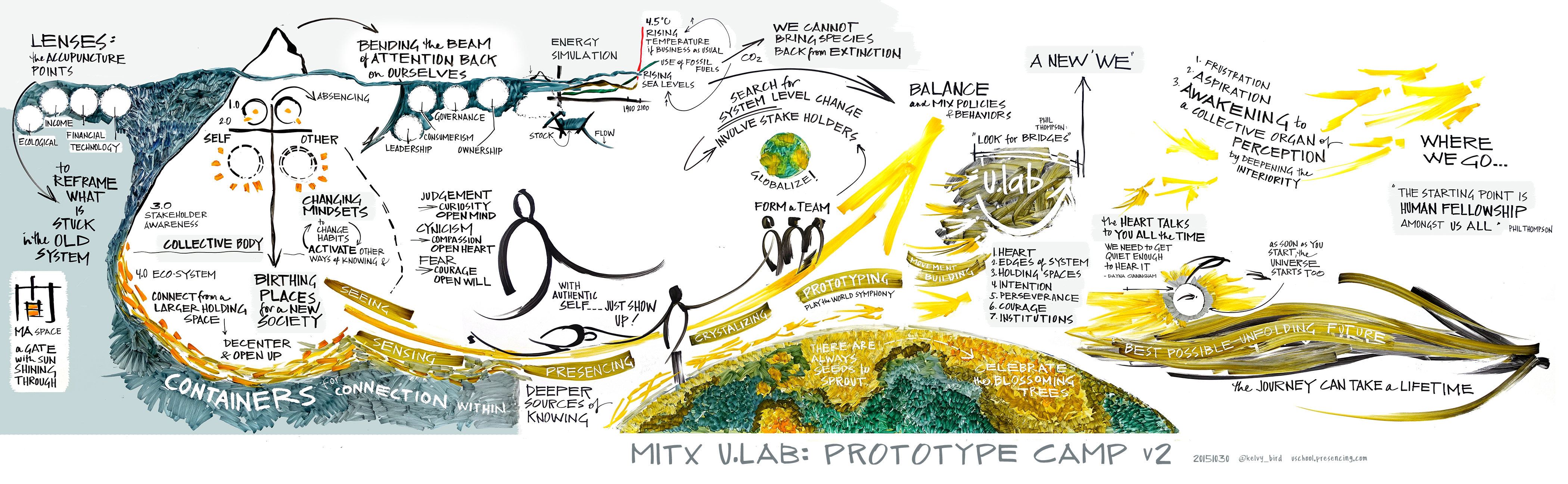
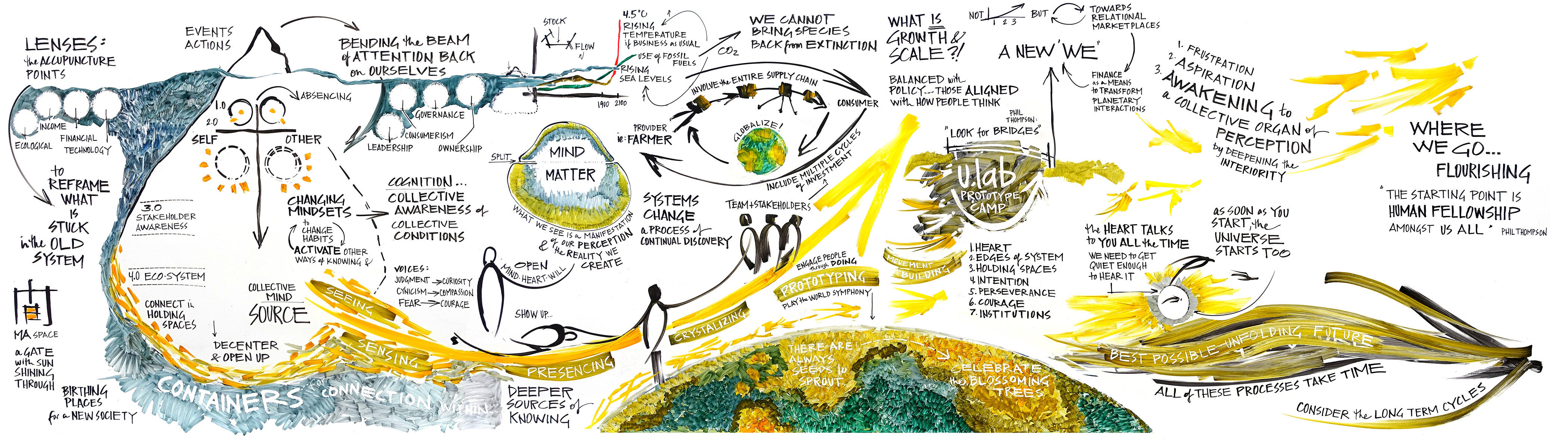
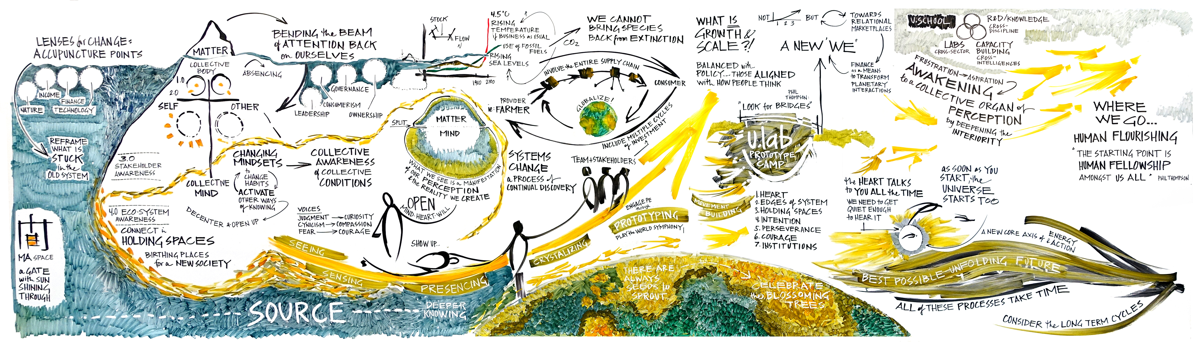
The unique quality of this 14-foot image is that it represents a four full cycles of build, overnight pause, and reduction – where only the most essential content carried forward into the final picture. The drawing process itself mirrored the prototyping process in the room, offering an iterated and refined version of content each day. Though many phrases and sections met erasure throughout the program, the overall depth of the final integration demonstrates the power of this medium to reflect requisite change in idea maturation.
What are the standout features about the featured graphic recording that you would point out to a stranger who walked up and asked about it? Like, is it interesting because you used different shades of two colors to indicate a transition? Did you use a lot of cartoon elements this time? Etc.
The “secret sauce” of this image is the hand mixed dry-erase inks used to evoke potential (gold), grounding (olive), and source/spirit (blue grey). I start with an Neuland inks and squeeze them into Montana marker shells, meant for acrylic paint. This process is not recommended for those who are in any way apprehensive of drips and fumes! It’s not an everyday application, and can yield quite a mess if one is not confident with a very, very inky marker. But the combination also yields extraordinary serendipity in application, and very rich color.
Was there something about this graphic recording that was especially challenging (and that is somehow visibly reflected in the work itself)? How did you overcome that challenge in the graphic recording itself. (The talk was in English, but none of the audience spoke English, so you had to devise a system of pictographs on the spot and couldn’t include any words, and that’s why the GR looks the way it does.)
The challenge of this piece was the limit of space over four days, combined with a live broadcast to a global audience on the first day, requiring a full-scale drawing from the start. The program also needed a great deal of wall space for the presentations and participant work, leaving me tight in regards to real-estate. I know this seems like a crazy way to figure it out, but it helps with average budgeting: ~ 1” per minute (assuming a 4’ height), ~ 30” width per 30 minutes, ~ 8’ for 90 minutes, etc. The ~14 hours of scribing in this design would have called for ~75 linear feet. But I had 14 feet, bringing my ratio of room/time WAY down and forcing a ratio of synthesis/time way up.
Essentially I had to collapse the breadth into layers. In order to have impact, I wanted to go large and aim for depth. Embracing a daily, iterative approach seemed the only possible solution. This involved drawing, erasing, drawing, erasing, etc. each day – to represent four full cycles of work. I thoroughly documented each round, to not lose context and previous drawing.
Did you decide on or plan any elements in advance? Were there elements that came out of a flash of inspiration or that were improvised? In either case, what made them special?
I planned nothing about this in advance, even to address the wall space issue; it was not an easy solution to figure out, how to balance integrity with erasure.
The most exciting aspect to this piece was that the entire drawing ended up representing an unexpectedly coherent map of the topics in the room – not topics that were on the agenda at the onset of the program, as a more linear approach would have yielded, but instead related themes that unfolded through conversation, reflection, and learning in the room.
No key resulting sections could have existed without the others, and the relatedness of the content was particularly high: lenses for change (upper left), mind-matter split (base of the iceberg), questions of growth and scale (middle top), foundation of source and planet (bottom band), u.lab as an awakening organ of perception (upper right), and an unfolding heart-oriented future (right.)
For additional reference:
Wall Day One
(to come)
Wall Day Two
Wall Day Three
Wall Day Four
Final image with digital enhancement